
0%

Share
January 26, 2024
Think of your website as your dream online home – a welcoming space that tells your story and attracts all the awesome visitors you deserve. But just like building a real house, there are construction blunders that can turn your dream into a disaster. Don’t worry, fellow web adventurers, we’ve got your back! You can contact Pixenite for web design project but before that let’s understand the top website design mistakes to avoid this year:
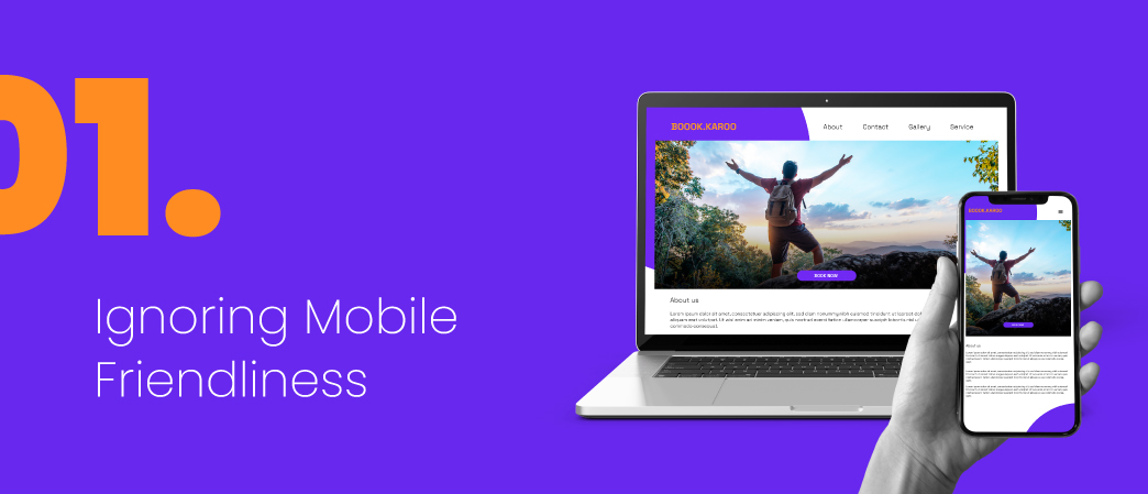
Remember that phone glued to your hand? Guess what? Everyone else has one too. In 2024, ignoring mobile friendliness is like building your dream house with a tiny door – most people won’t even be able to get in! Studies say over half of websites which are around like 55% visits happen on phones, so if your site looks like a jumbled mess on those screens, expect visitors to flee faster than a scared squirrel.
Fix-It Tip: Think chameleon! Choose a responsive design that magically transforms to fit any screen size. Bonus points for lightning-fast loading times on phone networks – nobody wants to stare at a spinning wheel while their lunch break ticks away.
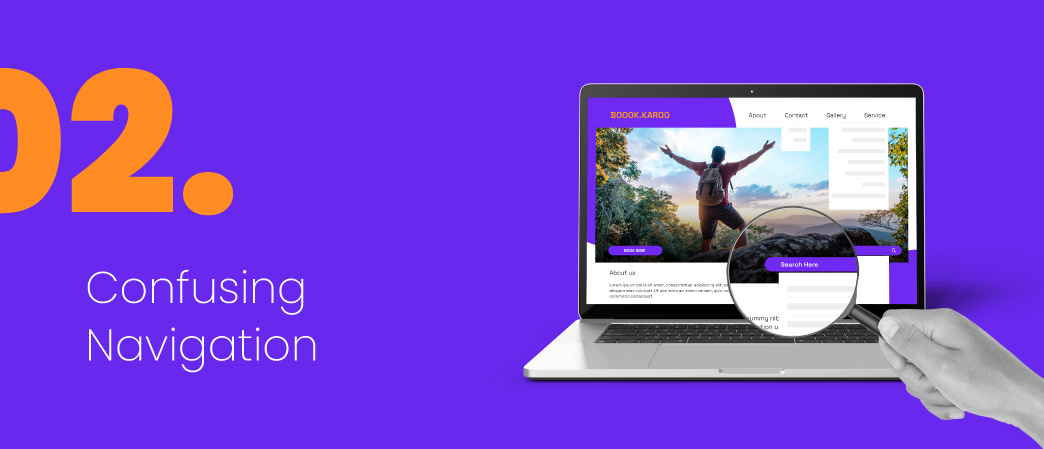
Getting lost in your own house would be annoying, right? So why make your website a confusing maze? Messy menus, broken links, and hidden “contact us” buttons will have visitors muttering “where am I?.
Fix-It Tip: Keep it simple. Clear menus with easy-to-understand categories are your friends. Think breadcrumbs (those helpful navigational trails) and make sure those links actually work! Testing is key – think of it like double-checking your house keys before leaving.
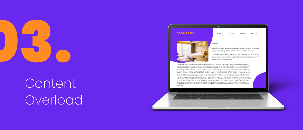
Sure, information is power, but on websites, less is often more. Bombarding visitors with walls of text is like trying to explain rocket science to a hamster – they’ll just glaze over and retreat to cat videos.
Fix-It Tip: Quality over quantity is the motto. Craft short, engaging content that speaks directly to your audience. Images and infographics are like colorful balloons that keep eyes glued to the screen. Remember, white space is your friend – it gives your content room to breathe and makes it easier to digest.
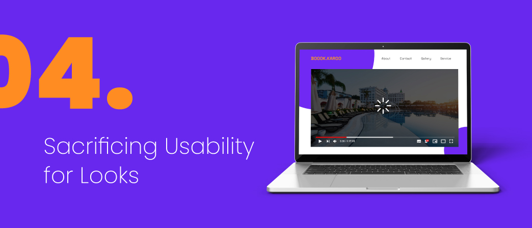
A stunning website is like a perfectly decorated cake – it’s hard to resist. But just like that cake might give you a sugar crash, a website that prioritizes flashy visuals over user experience will leave visitors feeling empty and frustrated. Think long, slow-loading animations, fonts that look like scribbles, and color schemes that make your eyes spin.
Fix-It Tip: Find the sweet spot between beautiful and easy to use. Choose a clean, professional design that complements your brand without making people squint. Remember, your website is a tool, not a disco ball.
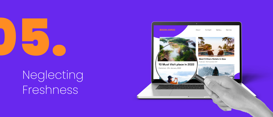
A website left untouched is like a dusty attic – creepy and unwelcoming. Outdated content, broken links, and stale news scream “abandon ship!” to potential visitors.
Fix-It Tip: Keep your website sparkling like a freshly cleaned home! Update content regularly with new blog posts, product info, and industry news. Fix those broken links like getting rid of cobwebs. Remember, your website is alive – give it some TLC!
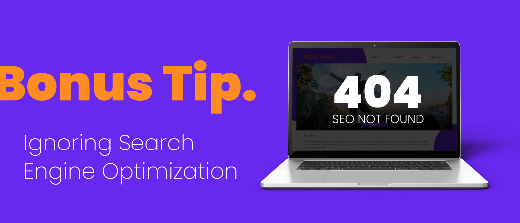
Think of search engines as friendly librarians who help people find what they’re looking for online. If your website is invisible to them, you’re basically whispering your brand secrets into a void.
Fix-It Tip: Learn the basics of SEO (search engine optimization). Use relevant keywords throughout your content, optimize images, and build connections with other reputable websites. Think of it as building a bridge between your website and those helpful librarians.
Avoiding these website design blunders will put you on the path to online success in 2024. Remember, your website is your digital storefront, your brand ambassador, your 24/7 salesperson. Don’t settle for anything less than spectacular which ultimately means Pixenite! And if you ever get lost in the web design wilderness, fear not – web design company like ours are always here to help you build your dream online home!
